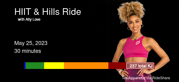
Vacation days are great! Today I improved RideShare, my Shiny app that makes shareable ride cards from my Peloton workouts. I had to update to accommodate the new images that the API sends, and I added a clickable history to build cards for any recent ride. I don’t like the styling of these new images quite as much – they’re not as powerful-looking cycling-specific images as the old feed provided – but I’m still really pleased with what I can build with it!
- really good workout
- helped make spritz cookies
- wrapped gifts
- fixed oauth flow of my shiny armorer app for Destiny 2
Python + R in Quarto
I’ve been using Quarto for just about everything I can for the past year, advocating for it enthusiastically with anybody who will listen, but today was the first time I started experimenting with combining python and R in a single Quarto document.
Look, I’m somewhat on record as not liking jupyter notebooks. I don’t like how the file format requires an interpreter, which I feel hurts readability and portability. So I’m predisposed to really like something that reduces that friction, and, wow — python in Quarto hits it.
And passing data, interactively, between R and python kernels within a single interface of a Quarto document? That’s mind blown meme territory right there. It might motivate me to learn more python in an environment I like to work, and should also be a great gateway to go the other way: The python to R pipeline! I’m envisioning some learning and tutorial work that takes advantage of both approaches, just deeply excited about what it opens up for doing data work and data people.
See more: Nicola Rennie’s post is a great overview, and I also learned from Danielle Navarro’s writeup of using reticulate.
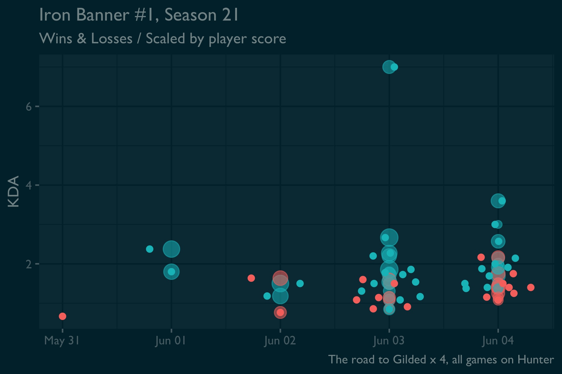
Destiny 2 talk: I had a good time in Iron Banner games this weekend. Most of my matches were fun. I didn’t have any long losing streaks like last season, and really liked the build I settled on. Maybe next time I’ll play my other characters, but it’s all for fun now that I completed the gilded title one more time!
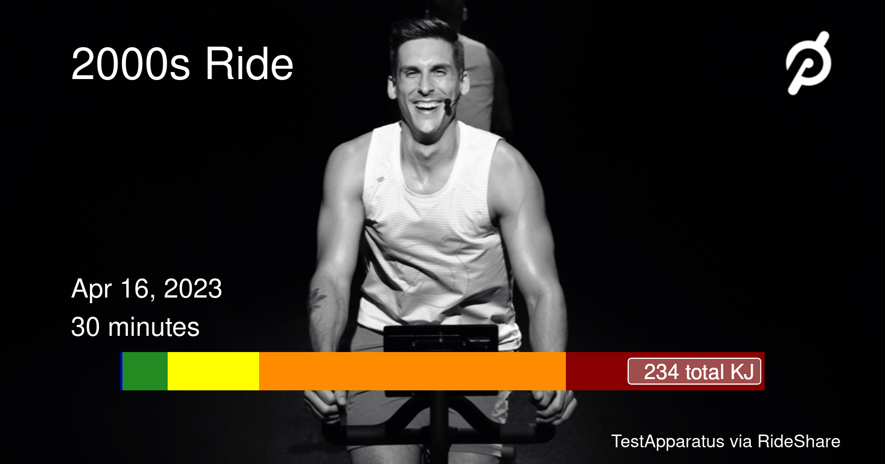
This morning’s ride was a good start to a busy Sunday. I also got to test out my custom little Shiny app for building nice little shareable images with the Peloton API!
The launch of the new Destiny 2 expansion, Nightfall, adds a new subclass – Strand – and restructures the mod system that affects player stats gained from armor. I’m happy to report that it only took me a couple of hours to revise my Shiny tool to find optimal armor loadouts using the new mods and subclass fragments! I had to hunt a little through some old code, and next time it should be a simple and easy update due to having fixed how I work with the manifest.
👍 Christmas Eve, so far:
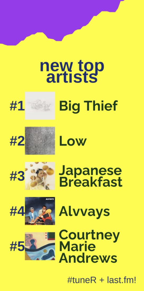
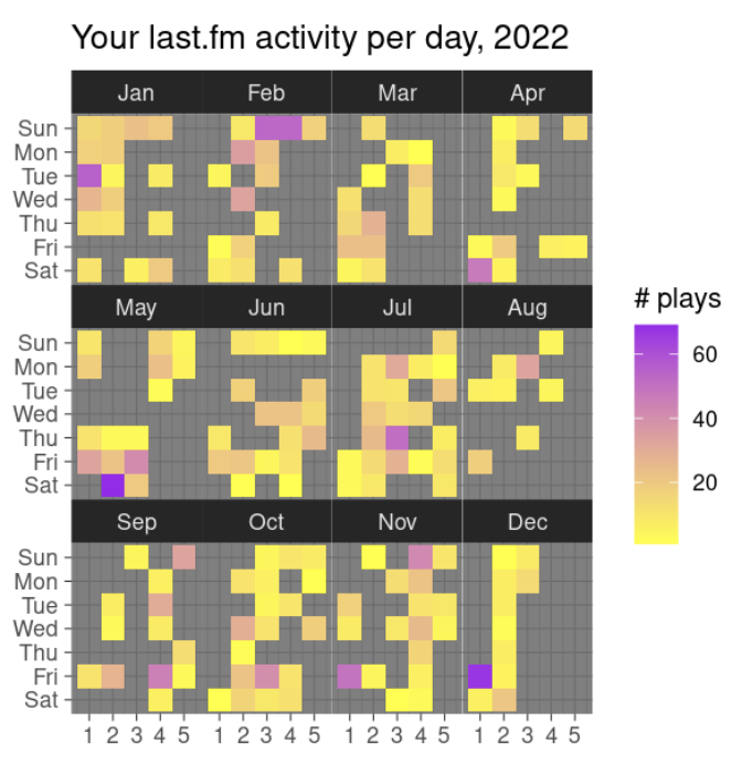
I dusted off the last.fm data visualizer that I started working on last year around this time. This year I built a couple of fun Spotify-wrapped-like visualizations; why should Spotify users have all the fun?
If you’re a last.fm user, you can try it, too! TuneR is a small Shiny app that you can provide your last.fm username and see your year in music, a comparison of this year to your all-time most-listened artists, and a fun heatmap of your listening activity.
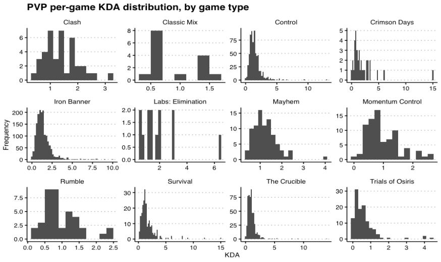
Every wonder how your Destiny 2 PVP performance varies across game type? I have. So I made some pictures.
I’ve had a really nice hobby R coding weekend, learning to use {gganimate} to make plots like this. I’ve been re-tooling all my old piles of fish scripts that I’ve used to gather my Destiny data from the game’s API. Now I have a useful pair of quarto notebooks that retrieve data using parallel processing and produce this kind of output. I’m super enthused by what I’ve learned!